Indus Typography
Background
Writing stands second only to language as one of the greatest inventions of human history. It enables communication and collaboration over distance and time. It is the basis of civilization itself and its ability to organize. It is what makes history possible.
In the Indus Script we see one of the earliest forms of writing. We find inscribed seals in both Mesopotamia and the Indus from roughly 3500BC. In the Indus, we find steatite seals like the one in Fig. 1 used in large scale during the Mature Harappan period (2600-1900BC). Across the length and breadth of a region the size of Western Europe, and for close to a thousand years, the script emerges fully formed and remains standardized with little change.
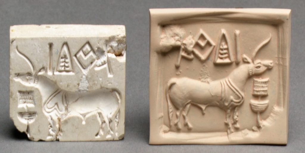
Indus seals also represent one of the earliest forms of printing. A seal was used to stamp its contents on a medium much as Gutenberg’s printing press would 4,000 years later. In the process of creating the ida font, a commercial-grade open source font for the Indus script, it became clear that these inscriptions are more accurately described as typefaces. Their typography is comparable to modern sans-serif fonts. Their emphasis on minimal and elegant design is something that we are only recently beginning to standardize upon as we create responsive interfaces for tablet and mobile devices.
Gutenberg’s real innovation was in the creation of movable type, where the same printing plate and letters, could be reused across multiple different pages and books. This allowed for mass production of books and forever changed the economics of publishing. In 1450 Gutenberg printed the first Bible and a scant 50 years later there were more than a 1,000 printing presses and as many as 8 million books printed.
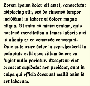
But from a typography standpoint, Gutenberg’s Bible was printed in a Blackletter typeface as in Fig. 2. This was similar to the Calligraphic styles that monks used in hand-written manuscripts. In the 15th and 16th centuries, Roman typestyles became popular because Blackletter was difficult to read. These were inspired by Roman monumental inscriptions that featured serifs and diagonal stress, i.e. the axis of the letters was tilted as shown in Fig. 3. Serifs helped make text more legible by guiding the eye down a stroke. In the 1900s we find the adoption of Sans Serif fonts which had a vertical stress and the absence of serifs. They led to clean and minimal typefaces that were easy to read. In the modern digital era, Sans Serif typefaces are often the recommended choice because of their legibility even in constrained form factors.

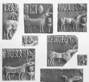
From a Typography standpoint, as we can see in Fig. 4, the Indus seals are much closer to modern fonts than the state of the art at the time of Gutenberg. They are characterized by simple and straight forms with the overwhelming majority having a vertical stress. They were typically “Sans Serif” in design and represent clean and elegant typefaces. Given the severely constrained form factor of a seal, often no more than 3 to 5 cm in breadth, this minimal design was the natural choice. Our modern typography was something that the Indus Civilization adopted right from the start, most probably for the same reasons.
The longest inscription discovered till date is no more than a couple of dozen characters long so we have no idea what kind of typography they used in long form copy. It is possible that they were more calligraphic in nature than a seal and could have employed completely different styles.
The seals were hand-carved so did not need to concern themselves with sizes and typesetting, with fonts and reusability. But they were not free-form calligraphy either. The achieved a remarkable level of standardization across the entire realm, and were more akin to TrueType fonts than bitmapped ones, they were more defined by relative proportion rather than “pixels”, more by “math” than by “data”. In creating the SVG drawings of Indus characters for the ida otf font, it was remarkable how they naturally “fit” into their respective em-blocks and with one another, as if they were designed for it; with minimal effort they became both modern and natural.
Design of the ida Font
The design behind the ida font is something I like to call “Gol-Gol Mota-Mota” which in Bengali means “round round, fat fat”. It aims to make the Indus script accessible and fun. It consciously tries not to take itself too seriously. Unlike the sleek and elegant typefaces of the actual seals, it aspires to give the text a more casual, child-like joy. As an example, the last two lines of Fig. 5 the typeface ranges from rounded to straight and flat, and, in the first line, back again. I suspect something like that would have made an Indus seal designer blanch; although one hopes it wouldhave brought a smile to their face.

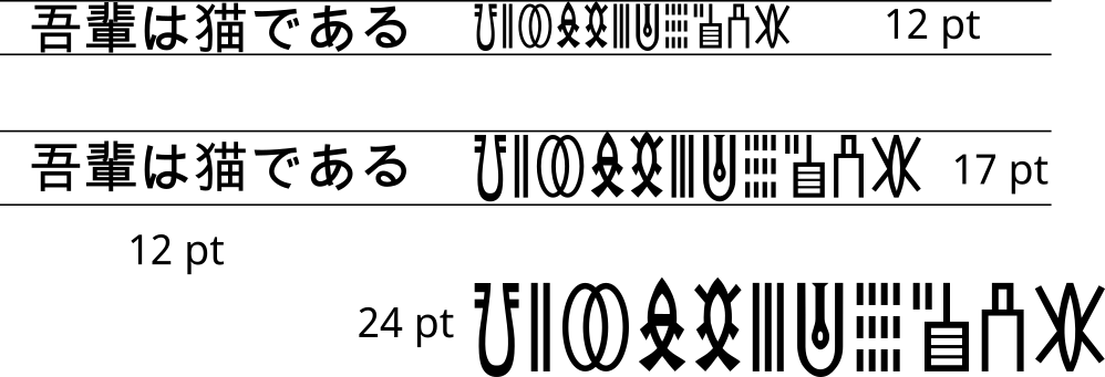
The ida font focusses on making Indus text legible on a computer screen. There are about 640 Indus characters in the font currently. This means it is more complex than any Latin or Western typeface but simpler than the Han characters in most CJKV fonts. If we compare ida, side by side, with a Kanji font, we see that the Kanji characters fully utilize a square em-size with far more emphasis on abstract strokes. The Indus glyphs (perhaps indicative of their use in seals) are tall and about half-width. This means at the same point size, the Kanji character is more legible because it utilizes twice the area. At the same width or twice the point size, the Indus character has roughly twice the area and seems much cleaner. So for a like-for-like comparison we need a point size 1.4142 times larger than the corresponding Kanji characters. In Fig. 6 we compare 12pt Kanji with 17pt Indus characters. The two fonts compare reasonably.
The Indus characters lose legibility as they become smaller. In order to compensate for this loss ida chose to give it a thicker weight. This is a design choice that the seals themselves do not make. As one can see from Fig. 4, the characters remain legible even in smaller sizes.
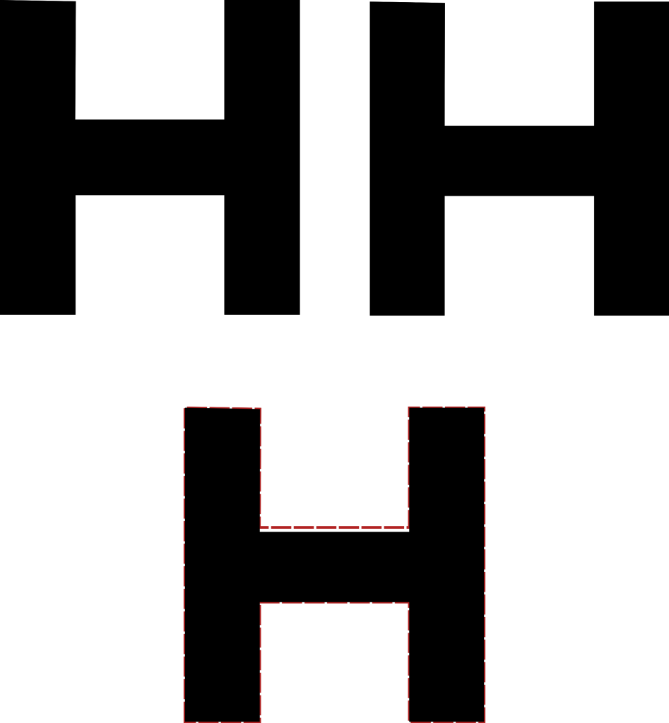
A modern typeface corrects for a number of optical defects that the human eye is subject to. As an example, in Fig. 7 horizontal lines need to be slimmer to appear similar to vertical lines. The H to the left has the same thickness for both but to the eye the horizontal line appears to be thicker than the vertical one. The one on the right shrinks the thickness by about 6% for it to appear about the same. The difference can be seen in the H in top bottom.
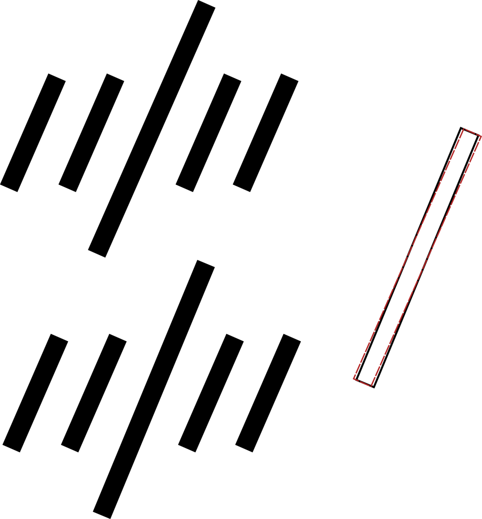
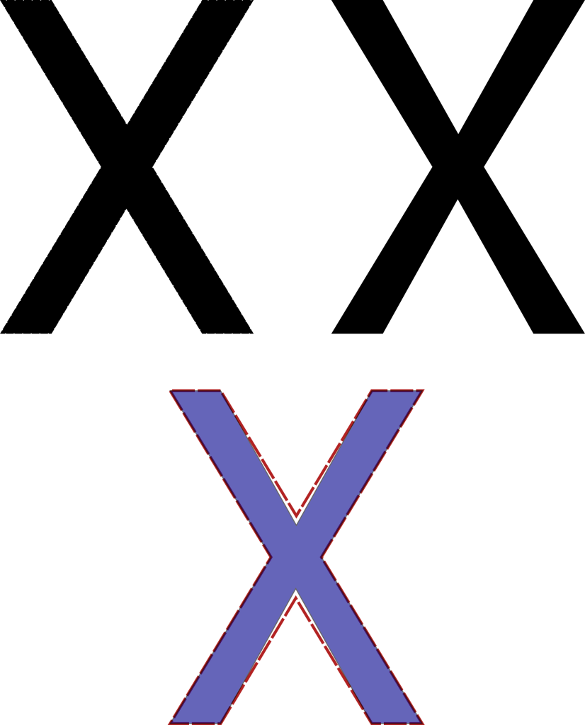
Similarly in Fig. 8, longer lines need to slant less than shorter ones to appear the same angle. The set of lines on the bottom corrects for this and appears more natural. The differences is about a few degrees. In Fig. 9, we can see that two crossing lines will need to be unaligned for it to appear aligned to the eye. Another principle commonly used in shaping modern fonts is that the shape of a glyph will contribute to how high it needs to be in order to look as if it is the same height as the other glyphs. In Fig. 10, we see that different shapes need different heights to appear equal. The point of the triangle and two curved edges of the circle need to extend further than the flat edges to appear the same.

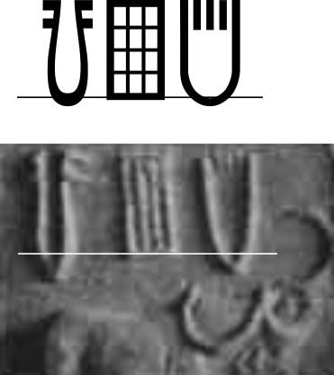
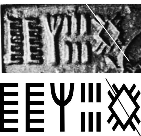
We find similar techniques being used in Indus seals. As an example, in Fig. 12 we see the same treatment of the difference in slants of shorter versus longer lines that we saw in Fig. 8. In this case to guide the unaided eye, even when the line is absent, it needs to slant differently than the shorter ones. Also, in Fig.12, the horizontal lines are drawn thinner than vertical ones. Like Fig. 7, we find that both the font and the seal itself corrects for this issue. In Fig. 11 we see that rounded glyphs extend further than flat glyphs in order to give the impression that they are of the same height. This is found both in the font as well as in the seals. There are a number of other techniques necessary to create a modern font and we see all of them in use by Indus seal makers.
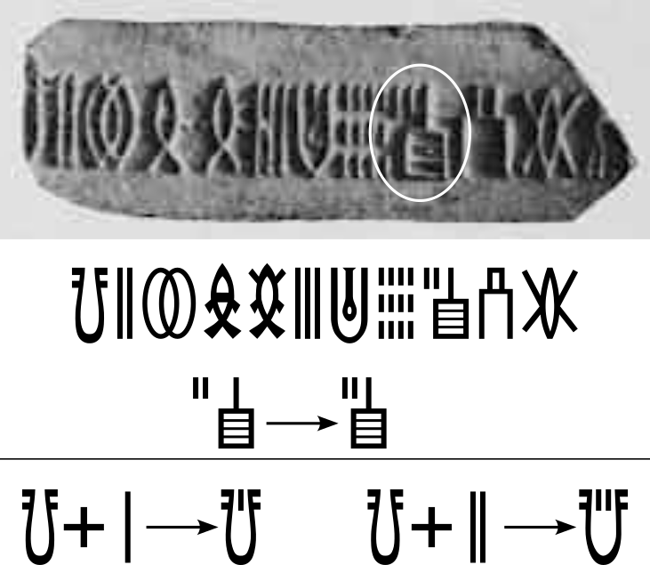
We find kerning applied consistently across all of the Indus seals. The two characters in Fig. 12 need to “overlap” in order to give a natural look. This is implemented in modern typography using Pairwise Kerning tables. The ida font had to create more than a hundred of such pairwise kerned characters as well as left and right bearings for every character to enable a proportional appearance that is present in every Indus seal.
In the Indus script we find glyphs that combine to give a new character form almost like a “ligature”. Unlike actual ligatures that are quite common in later Indic scripts, this is more like phono-semantic compound forms that give rise to over 90% of the glyphs in the Chinese script. The resulting compound is a separate character. This is discussed in some length in the Unicode encoding proposal.
Summary
In attempting to create a font for the Indus script, I got the chance to take an in-depth look at the sophisticated and beautiful typography with which they were carved so many thousands of years ago. This is an area that has not yet been studied in much detail. I hope this section can help contribute to an appreciation of the depth of Indus expertise in this field. It may be safe to say that Typography has a rich and storied past that goes back to the beginning of civilization itself. The Indus seals were an important part of that story.